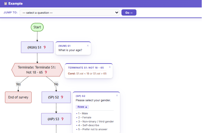
Anyone who has worked on a complex survey knows the moment: someone asks why a base looks the way it does, and you find yourself scrolling through hundreds of lines of script to reconstruct the logic. We've been there too — and it's why every client project at ATP Canada now ships with a flowchart that mirrors the questionnaire from the very first build.
What the flowcharts do
Each flowchart is a visual representation of the survey itself: questions, skip logic, randomization, and quota gates all laid out so the path through the survey is obvious at a glance. They're especially useful in three moments:
- QC: spotting logic errors before they reach respondents
- Explaining bases to data processing teams without scrolling through script
- Onboarding new collaborators to a complex study quickly
Tracking changes as the survey evolves
Surveys rarely stay exactly as written on day one. Stakeholders refine wording, add quota cells, or remove modules altogether. Our flowcharts double as a change log — every revision is timestamped and annotated, so when someone asks "when did Q7 stop randomizing?", the answer is a couple of clicks away.
“The flowcharts help visualize the survey logic and are great for QC and explaining bases to DP. They also keep track of the changes that have been made to the survey.”
Back to What’s New